I’m an Apple user and ordinarily a happy one, but iCloud is an abject failure.
Here are two (of many) reasons why.
Reason #1: You can’t get there from anywhere intuitive or convenient.
Apple insists that you access your iCloud files either through the application or through a browser. But I might not want to open the application or a new browser tab to manipulate a file.
All I want is a shortcut in the upper toolbar right next to the ones for Dropbox, Evernote and the like. Not at the browser level– at the OS level. This is easy to do and standard in the industry (see Dropbox, Google Drive and just about every other cloud storage option).
Here’s a mockup of what I mean:
Reason #2: Once you get there, you aren’t really there.
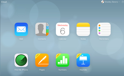
If you finally figure out how to get to the iCloud web page — which is the only place you can see a high-level view of the contents of your iCloud — it looks like this:
 While it’s nice to have the “Find My iPhone” app here as well as access to webmail, when it comes to the files I might have in Pages, Numbers and Keynote this is terrible.
Where is the total view of all my files? What if I want to group files from different programs into one folder?
Let’s say I’m creating a project — for my own business, for a consulting client, for one of my kids — and that project includes a spreadsheet for expenses, a word-processing document for all my notes and a deck of slides about the project. With a normal folder or a cloud-based folder from another provider I can toss all three files into one “Project” folder that is intuitively named and easy to find.
That doesn’t work with iCloud. I have to go searching through different applications to find things, and I’d better be neurotically tidy about file naming conventions or I’m sunk.
Oh, and if I’m composing an email and then decide that I want to drag and drop a file from iCloud into the email to share with my correspondent? Can’t do it. I’d have to download the file onto my desktop and then attach it. And if I “Share” the document from within iCloud I am giving my correspondent access to my original, not a copy.
What is so galling about this is that decades ago it was Apple itself (via Xerox Parc) that innovated the graphical user interface (GUI) that employs a spatial metaphor in which you put files inside of folders and then arrange folders within other folders. This is the “Windows” metaphor that Microsoft later scaled to every corner of the digital universe.
Generally, Apple is great when it comes to my work, my way, in my environment.
But the flip side is that Apple is terrible at anything involving more than one person. There’s a reason it’s products are called iPod, iPad, iPhone, iMac and iCloud. The “i” may be lower-cased but it’s narcissistically focused on the individual.
What I want is the WeCloud. Fortunately it exists. It’s called Dropbox.
[Cross-posted on Medium.]

Leave a Reply